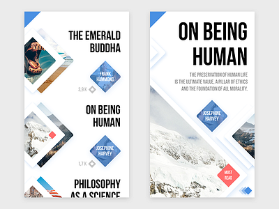
Books & Images Gallery
Hi guys!
I continue my research of totally new UX/UI philosophy. Trying to not follow the trends, but set them by my own. And that`s really tough and challenging thing. That`s why I love my work )
So, here is the first test.
I`m absolutely sure, that you know what is the blue triangle at the top mean. In case that almost all such options are placed at the same places, why each time we should add different icons/buttons, instead of simply mark them somehow.
What do you think?
P.S. Let me know if you see another one trick here.
More by Provectus Design View profile
Like
