ThreadMeUp Sales Page
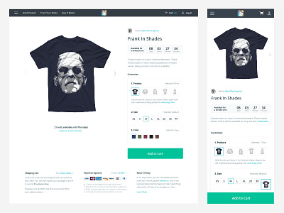

The most important UI of entire ThreadMeUp platform: the sales page.
This sure was a difficult one—I spent 75% of my time arguing not to 1-for-1 copy Teespring's sales page layout, and the other 25% A/B testing all the differences between what I designed and what Teespring had.
The fun thing that came out of this was some unique conversion quirks I didn't know:
1. Dropdowns for customization options = Bad
2. Nearly 90% of our sales traffic came from mobile...and they use PayPal.
3. Balancing an impulsive purchase UX with a continuous shopping one is difficult
4. Add to Cart > Buy It Now
5. Customers really trust lock icons and credit card logos
6. Green button CTA's are king
7. Sellers want to customize everything, even if it hurts sales