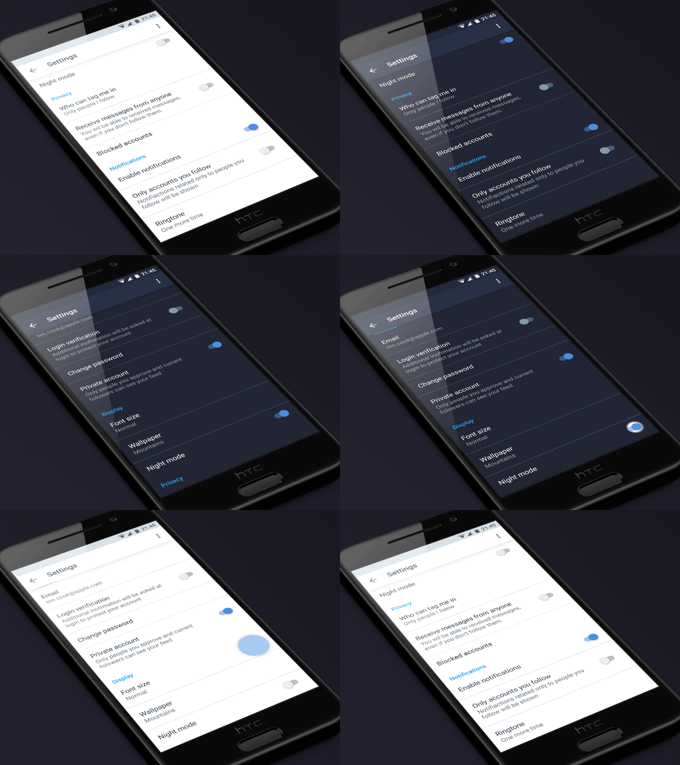
Material dark mode
It's nice to have dark/night mode available in certain apps, like Twitter so the UI is more user friendly - pleasant to the eyes - in dark environments.
But the switch between those modes happens either via crossfade, which has an unpleasant flash effect in the middle of the transition or via fade out, fade in, which leaves empty space in the middle of transition.
It would be nice if the switch happened in material style - expanding from the toggle UI element. That would be more user friendly and would feel more engaging as well.
More by Vitaly Silkin View profile
Like
