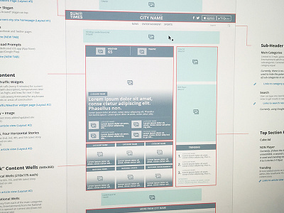
Sun Times Network Homepage Wireframe
After uploading wireframe for Werewolf homepage, I got self-conscious about shades of grey I used: were they too warm? Would people respond more positively if I used a blueish grays and more white? Maybe some arrows pointing at things and some text will make it more visually interesting?
I'm such a nerd.
Anyways. I looked back some of my other wireframes I've done to figure out this ridiculous, superficial dilemma and saw this one for V2 of the Sun Times Network homepage done in Fall 2014. This would be template for homepage for every city in network, like Chicago, Milwaukee, etc.
Man, I love a detailed wireframe.
More by Josh Martin View profile
Like

