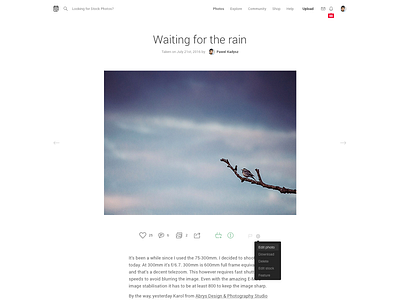
Tookapic photo page simplified
Another tookapic page simplified. Looks much cleaner. We're getting read of the "heavy UI" and leaving just the necessary elements.
Be sure to check out the attachment for full retina resolution. And you can also compare this to the current photo page design (same content).
More by Pawel Kadysz View profile
Like

