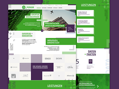
Website for an IT consultancy
A while ago I was commisioned to come up with a visual language and some screendesigns for the digital appearance of an IT consultancy which main identity elements are opposites and the combination of those. Mathmatic iconography, intersections, multilayering, overlays and change of perspective were style elements I created for them.
Not more not less.
More by Andy Jörder /// ND80 View profile
Like

