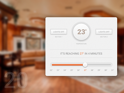
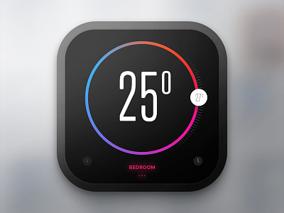
Day 20 - Thermostat
Hi,
So this is today's design, that I created. I'm not really satisfied with the colors, they look a bit boring and too greyish. Originally I used red to highlight things, but that's a dangerous color to use if it's connected to heating, right?
Any ideas how could it be better?
Best,
Zsolt
You can check my previous works on my Behance profile.
More by Zsolt Szilvai View profile
Like

