Intellirent Mobile
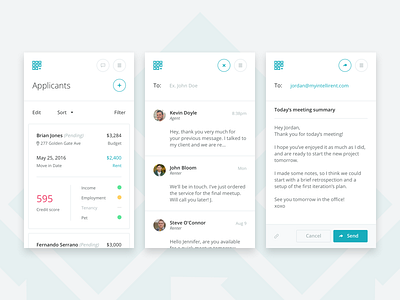
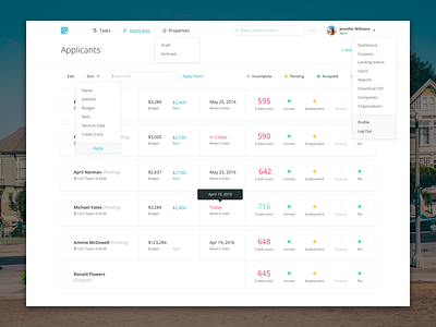
We’re not focusing on creating a native app at the moment, so I needed to be sure that our desktop version of the app would scale down seamlessly (I know, mobile first approach and stuff, but we’ve started with the big app first).
When you see, that the scaling of your app doesn’t require a lot of adjustment and changes, then you may be pretty sure, that you’ve done your job properly.
Using some neat tricks we were able to give the user a feeling of continuity and made sure that whatever screen size someone’s using, everything would be self-explanatory.
See the attached big picture of some more screens (List / Modal / Messenger / Menu / etc.)
- - - -
Press "L" to show some love :)
More by Maciej Jasiński View profile
Like


