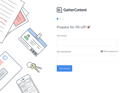
Sign-up form
Cheeky preview of our newly launched sign-up form. The aim of this was to reduce the full-on situation of being presented with 7 fields all at once during sign-up.
We're working on lowering the barrier to entry when signing up, and this is the first step toward that.
More by Benjamin Hawkyard View profile
Like
