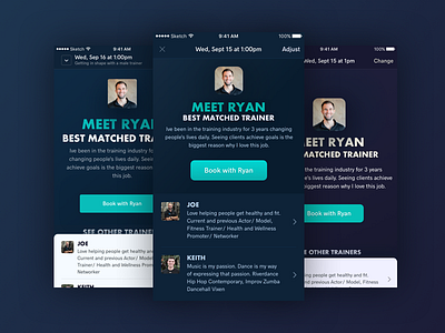
Trainer Matches & Results
Started some concepts for the trainer matches screen. The one in the middle feels the best so far, it went through a few iterations and feedback loops so far. Big thing with the left and right versions was that the hero area was too large and the contrast on the bottom white area was too high against the dark background.
Will, see where it ends up!
More by thoughtbot View profile
Like


