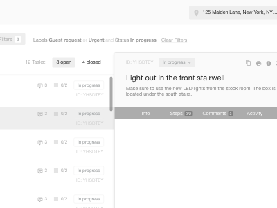
UI exploration (in greyscale, like you do with logos)
I've recently experimented with using only shades of grey to explore UI design ideas. I find it really helps with the overall IA of a page, especially when there is a significant amount of information to display.
More by Chris Bobbett View profile
Like


