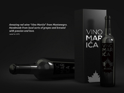
Vino Marica / bottle packaging
Hello Dribbble! It's really an honor to be here as a designer. For my debut shot I decided to go with my father's red wine label and packaging I did in 2015/16. The red wine was exquisite and hopefully this year's will be as good as last years. Tell me what you think!
The label is printed on a black matte PVC foil with stenciled lettering and shape of a falling / fitting leaf. The idea was for the label to be the least dominant part of the wine. You'd have to take the bottle in your hands and play around with it to see the label and information. This causes the wine to be more intimate. After drinking from the bottle you get more light into it and red glimpses appear where Vino Marica typography is located.
On another note, I owe my biggest thank you to Elias Sebastian Tinchon for the invitation and in this particular case to Dominik Van Treel for the amazing mock up he created.
