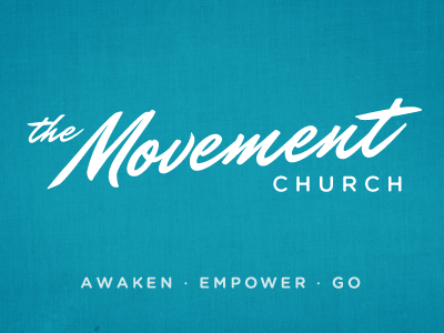
The Movement
Working on several branding directions for some good friends who recently moved to southern Orange County to start a new church.
With the logo mark itself I wanted to come up with a direction that has personality but overall is neutral enough that it can be presented more progressive or traditional depending on the design elements.
I wish I could take credit for hand sketching the font, but it is a tweaked Mr Dafoe by Sudtipos. The rounded, sans-serif is Gotham Rounded by Hoefler & Frere-Jones.
More by Jonathan Moore View profile
Like

