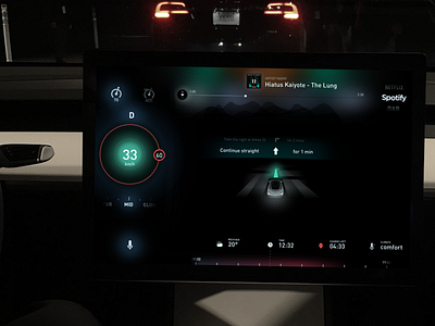
Day 6 - Tesla Model 3 UX and UI
Principle animation flow here > https://dribbble.com/shots/2967681-Day-10-Tesla-Model-3-UX-UI-Animation-flow
Day 6 of my 100 days of UI challenge. I have finally compiled all the previous shots into a single centre display touch screen UX and UI. All elements on the screen can be interacted with, each function giving the driver access to further information.
Remember this is a system without a cluster, steering controls or a HUD. All interactions therefore take place directly on the touch screen.
The entire UI has been stripped down, to keep only the most useful information for the driver. And I've tried to do away with the usual grid structure to experiment and see if one can design without creating borders and instead using empty space to illustrate separation
The UI is imagining an intelligent system that you can speak with to access any of your core functions, including talking on the phone, searching for music etc. The mic essentially behaves as an access point for all your traditional car functions, Phone, Music, Navigation etc.
The gradient below is indicating what the car climate is up to. If it is heating, it glows red. There is no reason that the car cannot be intelligent enough to understand what comfortable means for the driver. And there is no need for the driver to constantly adjust climate.

