Car battery indicator

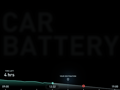
#5 This is my fifth upload out of 100 in my 100daysofUI challenge. I tried to simplify what is showcased in the battery indicator in an electric car. Focussing only on time to destination and not so much the percentage of the battery as that information is harder to understand than when described in time. The concept of course is designed on a touch interface.
The red indicator informs the driver when he should possibly book a spot at the nearest charging station.
The reason why this graph is aligned to the bottom of the page is because in the actual interface I am imagining it at the bottom along the edge.
noel_braganza_5.sketch
90 KB