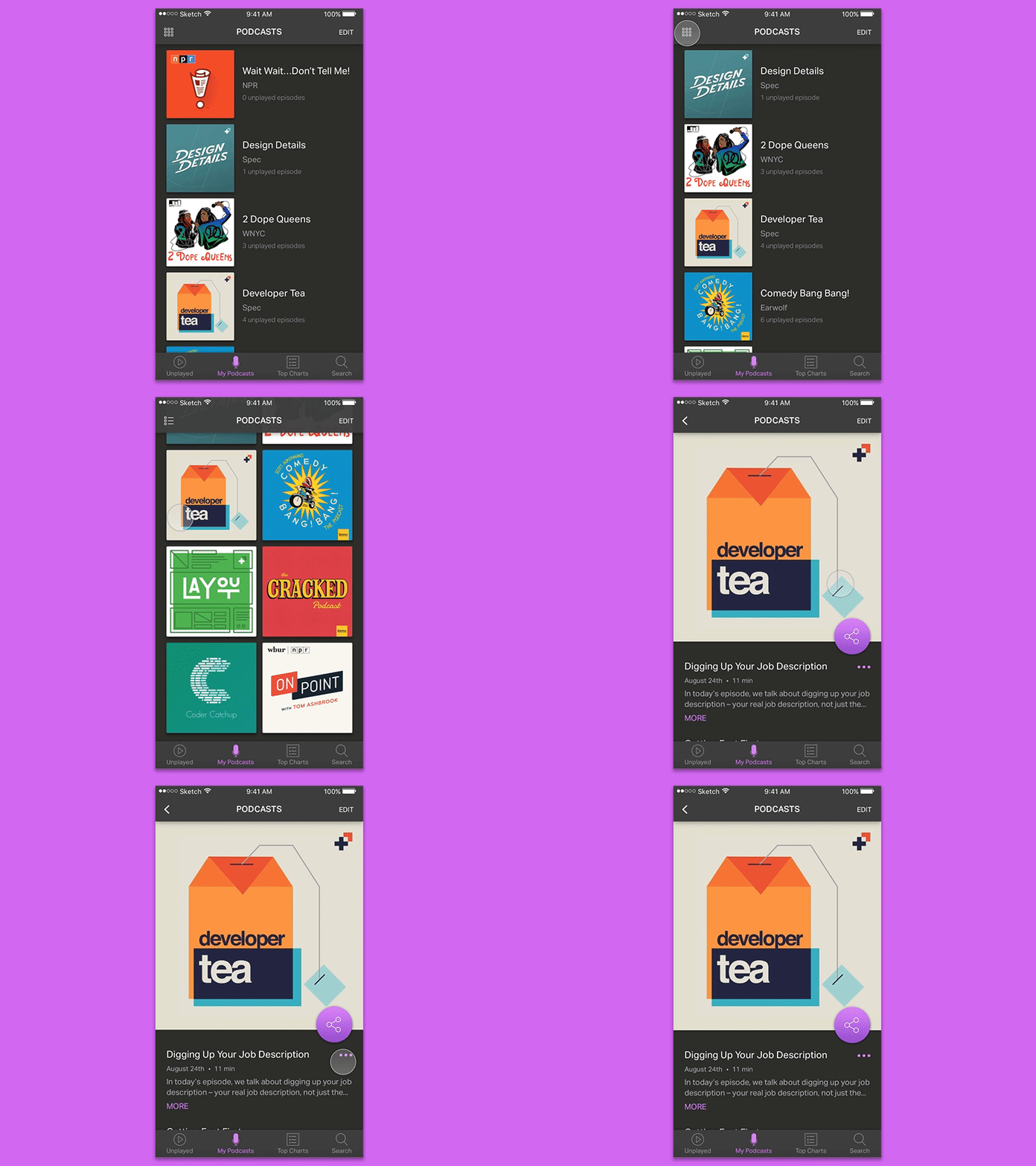
100 Days of UI - Social Share Button
Here's my "social share button" design for the 100 Days of UI challenge (created using Sketch and Principle)! When I read the the Social Share prompt – "Design a social share button/icon and be mindful of the size, imagery, placement, and purpose for sharing" – I immediately thought of Apple's Podcast app. I'm an avid podcast listener and I constantly find myself recommending shows to my friends, however, the current Podcast app user flow for sharing podcasts is a bit cumbersome. I decided to simplify this process by making sharing a "promoted" action by turning it into a floating action button. In addition to redesigning the sharing interaction, I decided to visually redesign the app as well. I decided to experiment with a "dark UI" – I found I was gravitating towards light user interface design elements, and so I wanted to push myself outside of my comfort zone – as well as incorporate a grid view in addition to the currently existing list view. You can see more images on Behance 😊👍
