Lobstr iOS app
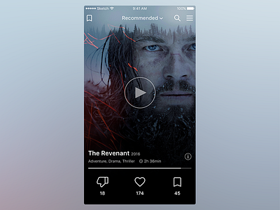
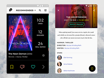
I've designed just the main screen of Lobstr iOS app and fully reconsidered it's structure and view. So there are lot of improvements such as:
1) I removed numbers on the right side and have combined them with the buttons at the bottom so the poster becomes bigger and the whole mock-up becomes much cleaner;
2) You can now watch trailer without going to the details screen;
3) The rating scale turned into more obvious and useful horizontal separator between info and buttons;
4) I've got rid of varicoloured palette in favor of more contrast and quiet combination of black and white;
5) I removed the "Skip" button at the bottom, it's unnecessary because we can swipe movies.
More by Anton Shiferson View profile
Like


