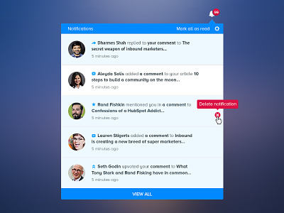
Notifications Redesign UI/UX for Inbound.org
Inbound.org is the biggest marketing community in the world. With over 100.000 members, the #1 goal of the product is to keep them active and engaged. The old notifications system was bloated with irrelevant information and too many updates.
The goal of redesign was to increase the adoption and frequency of usage and make the users more active in the community.
To accomplish this goal we made a couple of changes: we reduced the volume of the notifications and increased relevancy. We also used icons for each type of notifications to make easy for the users to skim. We added the picture of the member for each update to make it more social and engaging. The whole information structure was updated to make it easier to browse and read.
The feedback from the users was great, doubled by
increased usage of the feature.
Check out the detailed design in attachment and press L if you like it.

