DMA news index
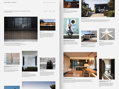
Here's the news index layout for Daniel Marshall Architects. This pages used a grid that is somewhere in between the highly structured grid from project and people, and the much looser grids of project galleries and home page. Some variation in image size, orientation, and alignment but still in keeping with the three column structure.
I think it works well to make browsing the news more interesting than it would be on a really structured grid with consistent image sizes. All of this exploration for DMA with irregular grids and varying degrees of variation and organicness is to maximise interest and delight as you flow down a page so you really want to explore and engage with the content.
Do you think it works?
----
I'm available for new design projects.
Need a design partner? Contact me at benek.nz
Follow me | Website | Behance | Pinterest | LinkedIn | Twitter
