Chrome Windows
Chrome 53rd release has hit the stable channel and with it the final step of our revamped core UI deployment, Windows.
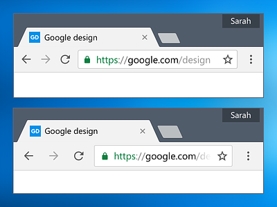
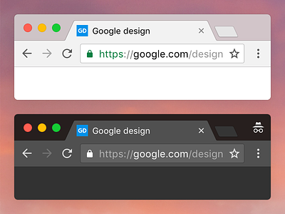
In addition of technical improvements in battery life and performance, the "chrome" of Chrome is now up to par with its ChromeOS and macOS counterparts. It brings new tab shapes, icons, color scheme as well as programmatic rendering to the platform. See the before/after shot.
Our new implementation allows us to be more flexible and to render Chrome precisely for all PPI configurations as you can see with the 150x and 200x previews.
Finally, Chrome for Windows carries the "Hybrid layout" feature, as shown in this shot. It is not yet enabled by default so for users on touch-enabled devices such as Surface and Surface books willing to try a more comfortable layout, simply head to "chrome://flags" and set the “Material Design in the browser’s top chrome” flag to “Material hybrid”.
Chrome is never done and there is a lot of design updates coming in a near future. To follow the latest experiments of the team, you can download Canary.


