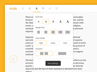
Kindle Cloud Reader - UI Redesign
I recently used the Kindle Cloud Reader (desktop version of Kindle) for the first time. I was pretty disappointed in the dark, heavy look of the UI (top bar, bottom bar, settings modal). Also, shouldn't Kindle know that pure black text on a pure white background is a little harsh on the eyes? C'mon! This is not an optimal reading experience...
Anyway, I thought I'd take a quick stab at another (lighter) version of the interface. Let me know what you think.
More by James Lavine View profile
Like


