New Roo
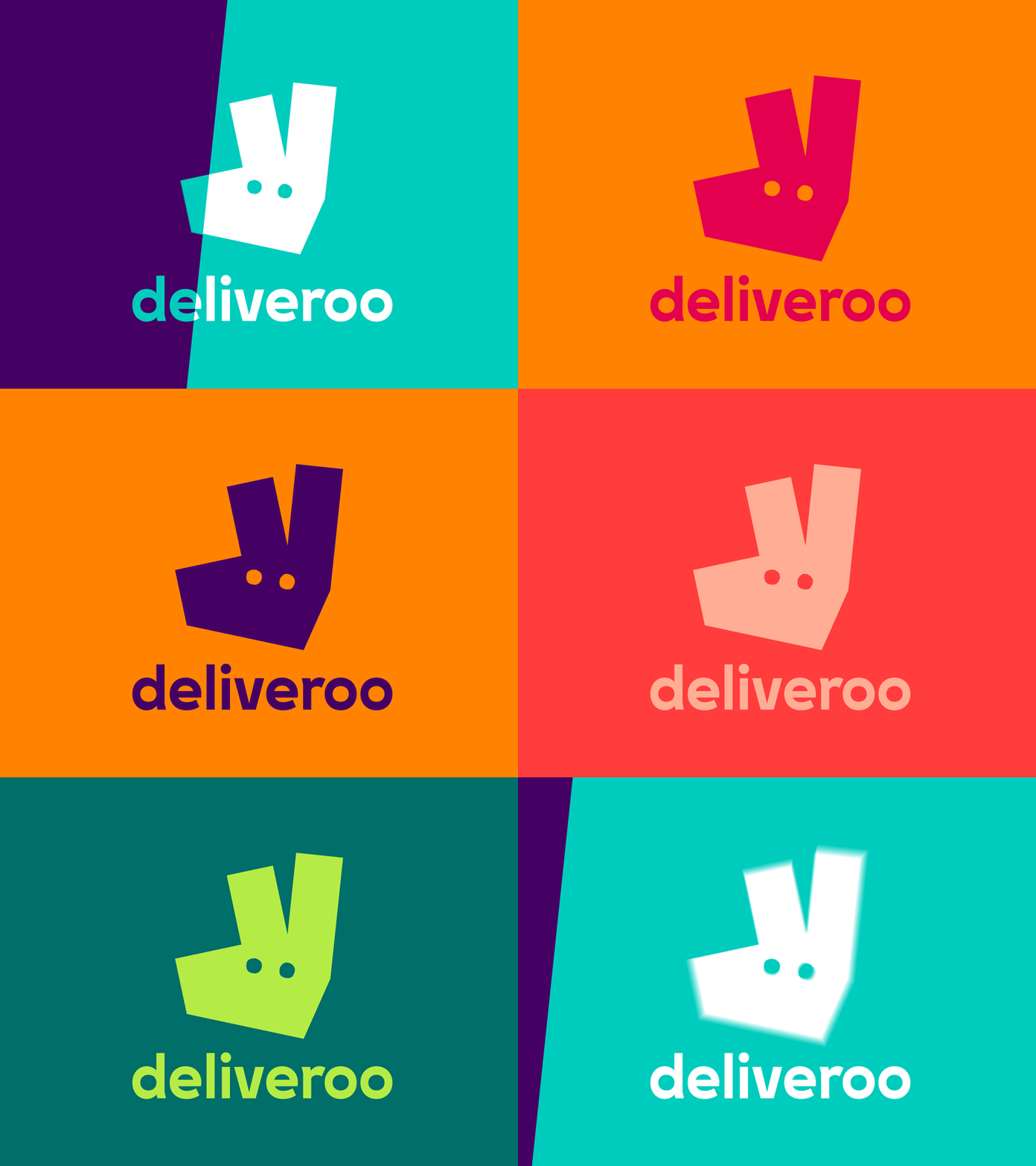
In collaboration with DesignStudio we explored a variety of routes for a new logo– some that kept the kangaroo as its primary inspiration, to completely new logos that left our kangaroo roots behind. What the process highlighted was that both internally and externally our Roo had become a beloved part of our brand.
What we landed on was an evolution from our original and more literal take on the kangaroo, turning it into a striking new mark bold and impactful, but still maintaining the character and charm of the Roo.
Importantly, this new Roo gave us a series of angles that would help the rest of our graphic system take shape. A system that would run across everything, from our site to our rider kit.
Read more about our new look on Medium https://medium.com/deliveroo-design/behind-our-visual-identity-7e106dab7b98#.sqtrxj27m
