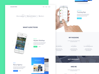
New Portfolio Site (2016)
Hey guys,
I’ve redesigned my portfolio site to replace the dark colours scheme with more light and bright colours. Also I removed all not necessary information and gave to the projects more space and importance.
Feedbacks are always welcome :)
More by Guglielmo Pardo View profile
Like

