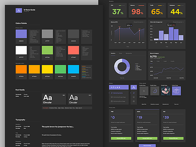
UI Style Guide
Hey guys. Today I'd like to share with you a style guide created for a pretty complex dashboard. The app will be targeting to devs and tech based companies that's why the UI is dark. It aims to solve the problem of monitoring services and assisting in the development process of software.
Check out the full view here LINK or @2x for retina display LINK.
More by Greg Dlubacz View profile
Like


