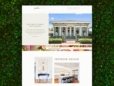
Perch Website Design
I absolutely loved working on this project. I used to be obsessed with this store and the fact that I was able to come up with a design for their new site blows my mind.
When you walk into perch, there are so many different patterns, colors, and styles to take in. It really is a unique place, so it called for a unique website. I tried to represent the stores mismatch of styles by using a combination of sleek and traditional typefaces, a balance of white space and texture, and let the photography speak for itself.
More by Legnd View profile
Like

