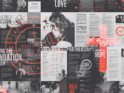
Leading The Way - 2016 Report
Our last shot got a lot of love and questions regarding this project we were never even going to show and with that encouragement we felt it would be cool to show the entire spectrum of this 2016 Annual Report we just wrapped up for Leading the Way Ministry.
The report is a full 28 page spread that has a specific type and color system but also a unique system for textures and brushes. This is the first time we have set a restriction on what type of texturing goes on specific elements within a design, especially one of this size. This was a bit of a game changer for us and something we will be exploring more of in the future.
TO GET THIS LOOK: Once we had each spread completed we laid out all of the final JPG images on a very large canvas. Once we had the spreads arranged how we wanted we then used our new GRANITE Photoshop Action Set to get that faded / dramatic black and white feel to cover all of the images. We then applied very subtle texture and noise on top of that then isolated some of the vector badges and type elements, enlarged them, gave each a loud orange color and set them to Lighten.
Thank you to everyone for your kind words and the encouragement!


