Style Guide
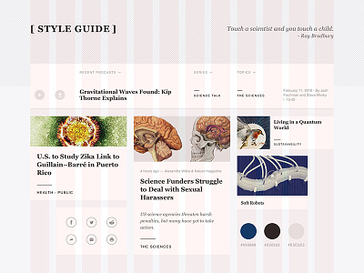
• To target younger generations, the redesigned style guide introduces card metaphor. Each card contains bit-size information and primary metadata, to help users browse more quickly.
• The responsive grid system is created with Bourbon Neat, which is fluid and using em unites and golden ratios.
I coded a prototype to test my design with Middleman. Link to the prototype: http://jieyuxiong.github.io/science_web/
A thorough design showcase is posted on Behance: https://www.behance.net/gallery/42209421/Scientific-American-Redesign-Coded-Prototype
More by Jieyu Xiong View profile
Like
