Google Fonts Improvement Project: Josefin Sans Proposal
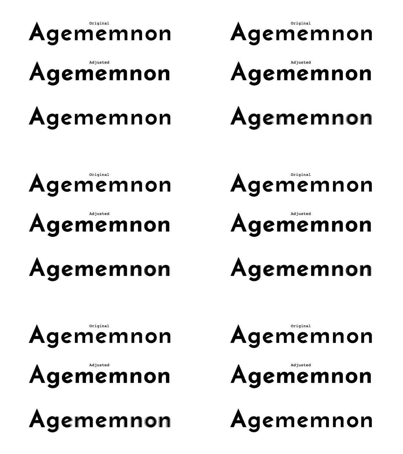
After an initial review of Josefin Sans, here's my projected improvements in this final design sprint:
• Darken the LC Bold Master
• Increase x-height of Bold Master
• Check Horizontal contrast for Bold Master
• Check Overshoot for Bold Master
Most apparent is the need to increase the joint of the /n family letters. They felt too light next to the /o shapes, no matter what kind of trick I tired in the horizontal stroke of the /n's.
More by Thomas Jockin View profile
Like
