Makeitbetter: Gojek
Hi guys!
For my second #MakeitBetter submission, I'd like to analyze Gojek app, especially this particular screen.
A little background, Gojek is a ride sharing service - similar like Uber- - focusing on motorbike ride in Indonesia.
Yesterday, while I was using the app for booking a ride, I just noticed some UI changes on their current version.
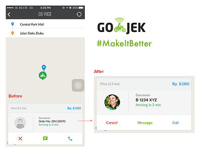
One thing irks me so much is passengers now won't be able to know their drivers vehicle plate number.
Let's talk about a passenger journey here: John has successfully booked a gojek during rush hour in front of a mall / office (pivotal area). He's now waiting for his driver outside and a swarm of gojek drivers can be seen; they are probably waiting for new order or their own passengers.
So how's John supposed to know which driver is assigned to him without the ability to recognise his ride plate number?
The easiest way is probably matching the driver's photo; but as you can see on the above screenshot, not all drivers is that obedient to upload their photo. Not to mention different haircut, moustache, weight, etc could alter faces so it won't be easily recognised in a glance, especially at night.
Another way is by asking the driver's name and order number. Mind you, he may need to ask those swarm of drivers one by one. Such a hassle. Indonesia itself is not well known as a country with low crime rate, what if a fake person with criminal intention disguise as a gojek driver and say yes to any passenger who is looking for his/her driver?
Also, the order number is a struggle to pronounce and memorize, and I bet nobody give a care.
Another option? Keep calling your driver and talk with him until you find him? Yes, I relied on this method at the end. As a service that aims to put an ease on customer, Gojek terribly fails on this one.
The solution?
Simple, put back the ride plate number in the app.
I want to be able to spot my driver.
I want to be assured that this driver is the one assigned to me.
Another note
Notice those 3 actionable icons at the bottom?
Icon is so ambiguous. If the circumstances allow, always opt for text instead of icon.
That 'X' on the left bottom corner puzzles me. Does it mean 'cancel booking' or 'close' that pop over screen?
The solution is also no brainer, change the icon with text; given that the space is enough anyway.
Comments and feedbacks are much appreciated :)
