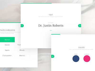
Design Studio – Basic Steps
Some of the steps involved in designing a PatientPop website. Super basic, step-by-step guidance.
Based on the colours, fonts, and images selected we can show a 'preview' of the website design as a basis to start from.
This puts the user in a mindset thinking about their brand image and core design elements before they see or think about their website layout. Overall simplifying the decisions needed and minimising choice.
Needed to work with a lot of constraints based on legacy web templates and a pre-existing onboarding process.
Very happy with the result and expect to iterate considerably once we get some feedback on this in the wild. Should be releasing soon!
More by Justin Roberts View profile
Like
