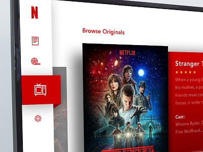
Daily UI 25 - TV App
I'v always wanted to take a stab at a re-design of Netflix. I simplified this down to its core. I might expand upon this design when I have more time but this was a fun little experiment. I went for a light UI versus the classic dark to freshen things up a bit.
Critiques and comments are always encouraged :)
More by Justin Jones View profile
Like


