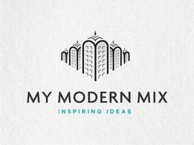
My Modern Mix Logo
This is the 2nd logo for an accompanying website to the original logo My Modern Met
This website focuses on collections of images, with more polish. So the general idea is the same, just a different slant on the content. So to keep the general identity consistent between the two 'My Modern' sites, I played with an alternative cityscape, still based on forming the buildings from the 3M's.
The roofs each have 3 'm shape' roof tiers, but the top one is far too small to see, so this needs adjusting. Not sure on the fonts, if this should be kept the same or maybe using another font. Things to consider.
First attempt, so the windows are not perfect, and other issues, but it's solid enough to present to the client.
More by Smitho.graphics℠ — Logo & Icon Design Studio View profile
Like
