DMA image grids
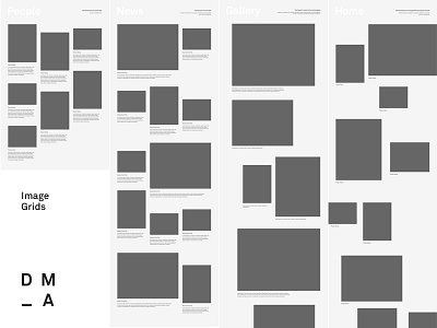
As promised yesterday, here are my initial image grid wireframes for Daniel Marshall Architects. These are all based on an 18 column grid.
For items like people and projects, it was important that each items remained about equal in terms of size and visual weight, so these items use the more structured grids on the left.
For the homepage, Daniel wanted something much more organic and fluid, with huge variations between image size, orientation, alignment, and spacing - so this uses the most fluid grid on the right.
Other pages like news and project gallery are in between - slightly more structured and regular but still some variation in size and alignment to add more interest as you flow down the page.
And all of these are carefully considered at responsive tablet and mobile breakpoints too (not shown here), with special attention to retaining some of that organic feel even when image sizes inevitably get more constrained and consistent on smaller devices.
This was quite a lot or work to plan out, but given the minimal aesthetic of the brand and website - THIS IS MOST OF THE DESIGN WORK. Now that these essential layouts have been determined the pages practically design themselves with some attention to type and image selection.
See attachment for some full size examples of the complete grids.
How am I going to make this work in front-end? Not sure yet! I'll have to figure it out as I go. Probably a combination of Isotope and/or more traditional positioning and floating. It will be a bit of an experiment but that's what makes it more fun to work on projects where the client doesn't mind pushing boundaries a bit.
Can't wait to show you more of this as the rest of the pages evolve.
----
I'm available for new design projects.
Need a design partner? Contact me at benek.nz
Follow me | Website | Behance | Pinterest | LinkedIn | Twitter


