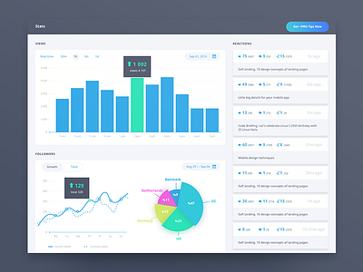
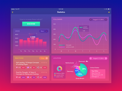
What if... there would be another color scheme
Hi dribbble,
There was a lot of buzz recently because of use of colors in ui design especially for data driven interfaces that require a lot of cognitive load for the user. This issue was critical for me too, so I decided to come up with my version of such Stats screen and to see what if... there would be another color scheme and how it would influence on perception of the interface. I couldn't resist and tackled visual and content hierarchy too.
It is awesome to jump on rebound because it's quite a challenge for every designer here on dribbble :)
Hey, guys, who have left a few lines of feedback on @Ludmila Shevchenko latest vivid shot, would you like to show your vision of this screen using the color scheme you think works best for such interfaces?
Looking forward to seeing you participating in this rebound!


