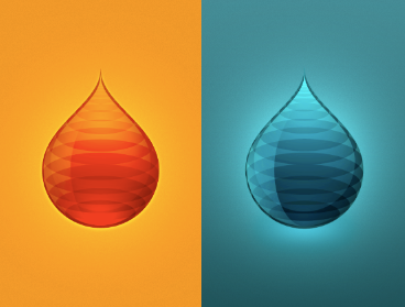
Wich drop?
So... the app idea was accepted to the second phase. yay!
So now back to the color. I tried the ambar thing and actually it looks more like Fuel or petrol, gasoline, gas, essence, juice what ever you call it..
This is going straight to the splash screen... But I need some feed back, being an application to track "fuel tank fills" (need a better description), what looks better to you?
thanks
More by Jorge Martins View profile
Like
