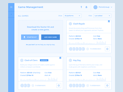
Game Management · Cards
An early exploration for the Game Management section.
Persona: A small-to-mid tier game development studio with 4 to 6 published games.
Task: Find a comfortable way to manage tasks, achievements, leaderboards, messaging and more.
Theory: The flexible grid view seems like the logical solution. 4 columns on large devices (≥1200px), 3 columns on medium screens (≥992px) and 2 columns on smaller devices as the iPad (portrait).
–
Testing: 2 simple tasks (Add a new game and add a collaborator to an existing game).
Findings: Our results show that, users are significantly more likely to scan all cards, and its content to check if the card they're selecting is the game they want to explore/edit. Which makes their task a bit harder.
We've updated the layout and came with a different solution (which is our final iteration) and the client was happy to see how compared to this first exploration, the users we're able to scan and find their games more easily.
Stay tuned, I'll be uploading the final solution and more wire explorations soon.
–
Created with PG's Product Design team.
