Mars
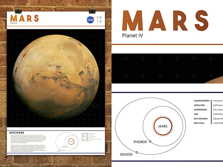
So while digging through old college projects, I found an abandoned project that I would really like to develop a little more. The project itself was to educate the viewer with large scale prints (24x36) with beautiful hi-res images of our solar system. Information combined with a clean and captivating design is aimed to engage and draw the viewer in to closely inspect it.
Top Right: All prints start with the planet's name and feature a color scheme with the 2 more average colors of the planet surface.
Bottom Left: A simplistic illustration of the local Mars with it's moons and type of planet it is. It is not shown yet, but I plan to make a legend explaining the difference between the types of lines demonstrated in the illustration. ie: Thick-Solid vs Dotted vs Double Thin, etc.
And to the far left is the overall poster itself. I'm seeing about 30 different areas I could improve on between some spacing, graphical additions, and adding additional information to make it more interesting.
Any feedback on what additional info to add, and/or what to play with is always welcome! :)
