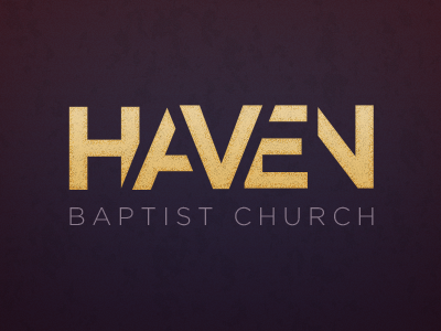
Haven, Take 2
Mixed feelings about this one. I love the look of overlapping letters, but the overall concept is a little shaky. Plus, the N feels a bit orphaned over on the right. Also, the treatment doesn't quite match the overall goals of the church itself. Thought at the very least it would make a good shot.
More by Jesse Gardner View profile
Like
