Edit View For Material Design
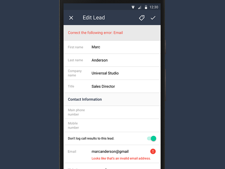
Material edit experience isn't the greatest when you have a long list of text field to fill in. Icons don't always communicate clearly what is it to be filled out by the users. Also the line height changes as it has to accommodate floating inline label text moves above the field.
After rounds of explorations, we embrace the two columns layout where we use text labels instead of icons to communicate complex concepts such as status, industry and source. And we always have the labels visible as users editing the form.
More by Base View profile
Like
