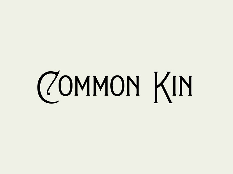
Common Kin logotype
This is the proposed logotype to have accompanied the monogram we've previously shared. Similar to many unused direction shots which leave you with nothing short of a cliffhanger, we're heading a slightly different direction that I'm definitely excited about.
The type here is largely derived/inspired by vintage seed and vegetable catalogues and packaging which seemed to so often feature an offset baseline, high mean line, spur serifs, and some good ol' fashioned quirkiness.
Would you be interested in seeing this face developed out in entirety?
More by Twin Forrest View profile
Like

