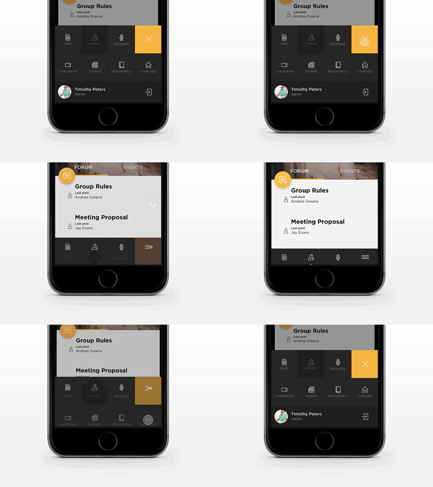
Bottom Menu
Hi Dribbblers!
Today I'd like to share with you this menu concept I made for one of the apps last year. Problem we faced was the navigation complexity and number of pages we had to have in the menu. At the same time it was important for us to use bottom menu instead of side bar one due to accessibility reasons. The solution I came up with you can see above — three the most important tabs are always visible, others appear once you tap on burger icon and you can still easily reach them with your finger.
I'm curious about your opinions. Cheers!
More by Karol Ortyl View profile
Like
