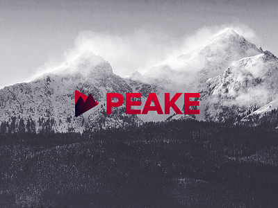
Peake Logo V.2
This is another alternate logo that I was quite fond of but didnt make it through because of various reasons. The client wanted to go in a direction that had theme of media and videography as that was their market.
I decided to stick with mountains as it had a nice connotation with the name of the company and encapsulated it in the play icon. I added a little detail of allowing one of the mountains to break out of the play icon and make it a little more dynamic and have a sense of depth.
FYI. I've changed the name of the company for anonymities sake.
More by Marcus Connor View profile
Like
