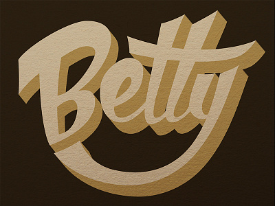
Betty
I produced this to get a feel for american 60s style lettering - the weight is near the top and the style mimics casual script brush style. I tried to give it a very washed out colour hue - quite vile really but less obvious than using bright garish colours.
More by Nina Cornwall View profile
Like
