National Park Foundation Rejected Mock
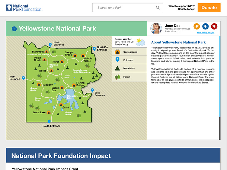
Here is a shot of the top portion of a website mock I was working on for the National Park Foundation. The idea here is that the user could interact with the map by clicking on the icons, and then the information on the right would change accordingly. You could also create a profile and earn badges by taking quizzes and mapping places you've been.
More by Stephen Sosa View profile
Like
