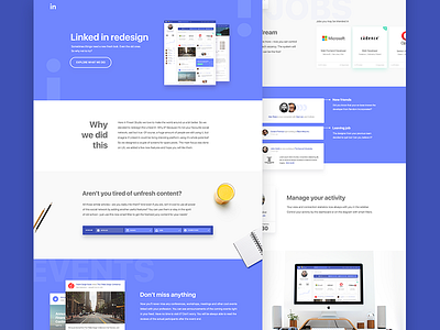
Linked In Redesign
Hi, my young UI-experts!
Today we’re sharing with you our version of Linked In. We strongly wanted to do something that will work, not only the pretty picture. So here’s two screens and a case study in attachments, so you can read a bit about the work we’ve done. Hope you, guys, will enjoy this project, it was really interesting.
More by Fireart Studio View profile
Like


