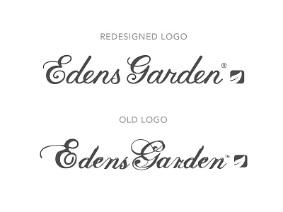
New Vs. Old - Logo Redesign For Edens Garden
The task was: redesign a client's old logo, refining it to be more modern and more clean, more friendly to small applications, without losing completely the brand equity and familiarity of the old logo. Shockingly, we launched the new logo all over their assets and none of their 100,000 daily clients even noticed! Win. The new script I custom created to be as similar as possible in the general forms, while being much cleaner, more whimsical, and less of the "distressed 2003 screamo band poster font".
More by Hoodzpah View profile
Like


