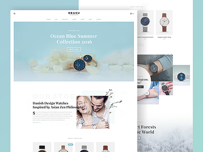
Obaku Website Concept
Hello Everyone! 👋
I bought a gift for my fiance, an awesome Obaku watch, and we are both amazed by the simplicity and elegance of the product itself. However, after we did some research online, we figured their website and logo could be improved. So I tried to apply the same level of simplicity and elegance to their website as well, I felt like the style between their products and digital presence online is un-matching. So here is my take, feedback is welcome!👍
Like what you see? Press L
- - -
Interested in working with me?
hello@kristijanbinski.com
Behance | Instagram | Twitter | Linkedin
More by Kristijan Binski View profile
Like

