Material Design for Wearables | a darker color system
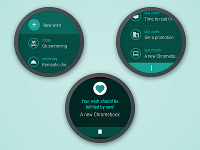
Material Design for Wearables - shipping with Android Wear 2.0 - has a new color system, darker than the original, and a new method to generate the appropriate palette for a given app Primary color.
Here I rendered an example of how the new color system is applied over the various UI components, using a palette generated from the classic Material Teal 500. The two renders on the top depict two states of a fictional Android Wear App implementing Material Design for wearables - can you spot a couple of new components? - while the bottom one is a notification fired by the same App.
For a more detailed explanation of the new color system you can read my Medium article: Material Design towards the Dark Side on Wear 2.0.
Please check the attachment for a high-res version!

