Nike Id
Customizing a product should be an elegant simple, intuitive and fun process.
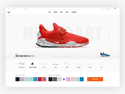
NikeiD's current ui and ux is seriously struggling. The user has to do a lot of work to figure out what part of the shoe they are customizing. The existing configure bar makes it unclear what progress you have made, and hovering over the shoe to figure out what you can customize is a pain - lets be honest. What really kills me is once I have designed a shoe there isn't a quick way to save it to do a direct side-by-side comparison.
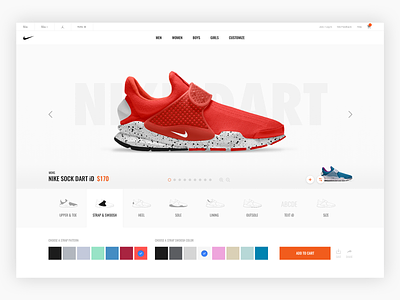
This romantic spin on NikeiD is an attempt at solving the configurator bar, making it over the top simple to figure out what part of the shoe you are customizing. I've also implemented an easy save and compare action that generates a "pip" thumbnail of your most recent design.

