Design Landing Page
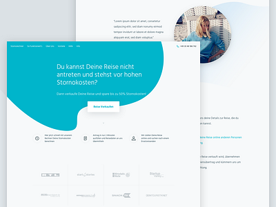
Have worked on a design for a website of a Berlin based start-up that sells holidays.
The iteration in this shot didn't make it, but the idea I had was to pick up the organic shapes from their logo (removed it from the design), and use them across the site and have them subtly animated.
Some parts of the design, such as the typography and brand colours, were already set by their style guide.
Make sure to check out the full view that's attached.
--
Crafted at @FCKNBOLD
Get in touch, We are currently booking new clients!
More by Pascal Gärtner View profile
Like


